Branding
One identity that holds everything together
UMBRALIS is the umbrella brand. Every sub-area — world, events, collectibles, creations — inherits from it instead of inventing its own look.
Logo is in exploration — no final mark yet
Real material
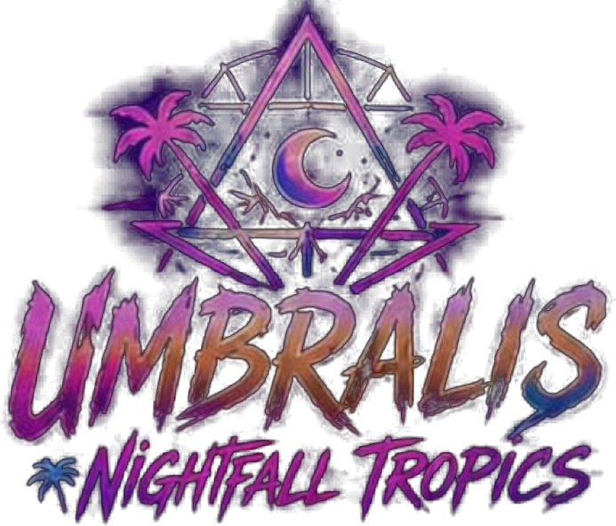
Reference material from the team
These images were provided by the project team. They are the closest thing we have to the real look and they take priority over concept art.
Architecture
How the brand is structured
A single master brand with named areas underneath. Areas get a label, never a separate identity.
UMBRALIS owns the palette, typography, logo and tone. Anything public carries it.
- UMBRALIS World
- UMBRALIS Nights
- UMBRALIS Cards
- UMBRALIS Creations
- UMBRALIS Community
Palette
Colour system
Night blue
Base background
Deep purple
Primary surface / brand
Magenta
Energy, nightlife accent
Cyan
Digital, interactive accent
Gold
Premium, VIP, rarity
Foam
Text and contrast
Gradient
The brand gradient is used for the mark, key highlights and hero moments — never as a full-page background.
Typography & logo
Type and mark direction
Typography
Umbralis
Sora — display, headings, labels
Manrope carries all body copy: soft, warm, highly readable at small sizes on dark backgrounds.
Logo direction
- A single symbol that works at 16px and on a backdrop
- Round or arched form suggesting moon, dome and shelter
- Gradient version for digital, single-colour for print and embroidery
- Wordmark always in Sora with wide tracking
Rules
Do and do not
Do
- Use the tokens, never raw hex values
- Keep dark backgrounds with neon accents
- Give elements room — space signals premium
- Use gold sparingly, for value and rarity only
Do not
- Invent new palettes per area or per event
- Stretch, rotate or recolour the mark
- Stack effects with no purpose
- Mix in stock templates or unrelated typefaces
NoteIf a design needs a colour or typeface that is not in this system, the design is wrong before the system is.